Interactive map element
Designed the interactive map at the heart of the trip view, so the route, stops, and places worth exploring feel tangible instead of buried in a list.

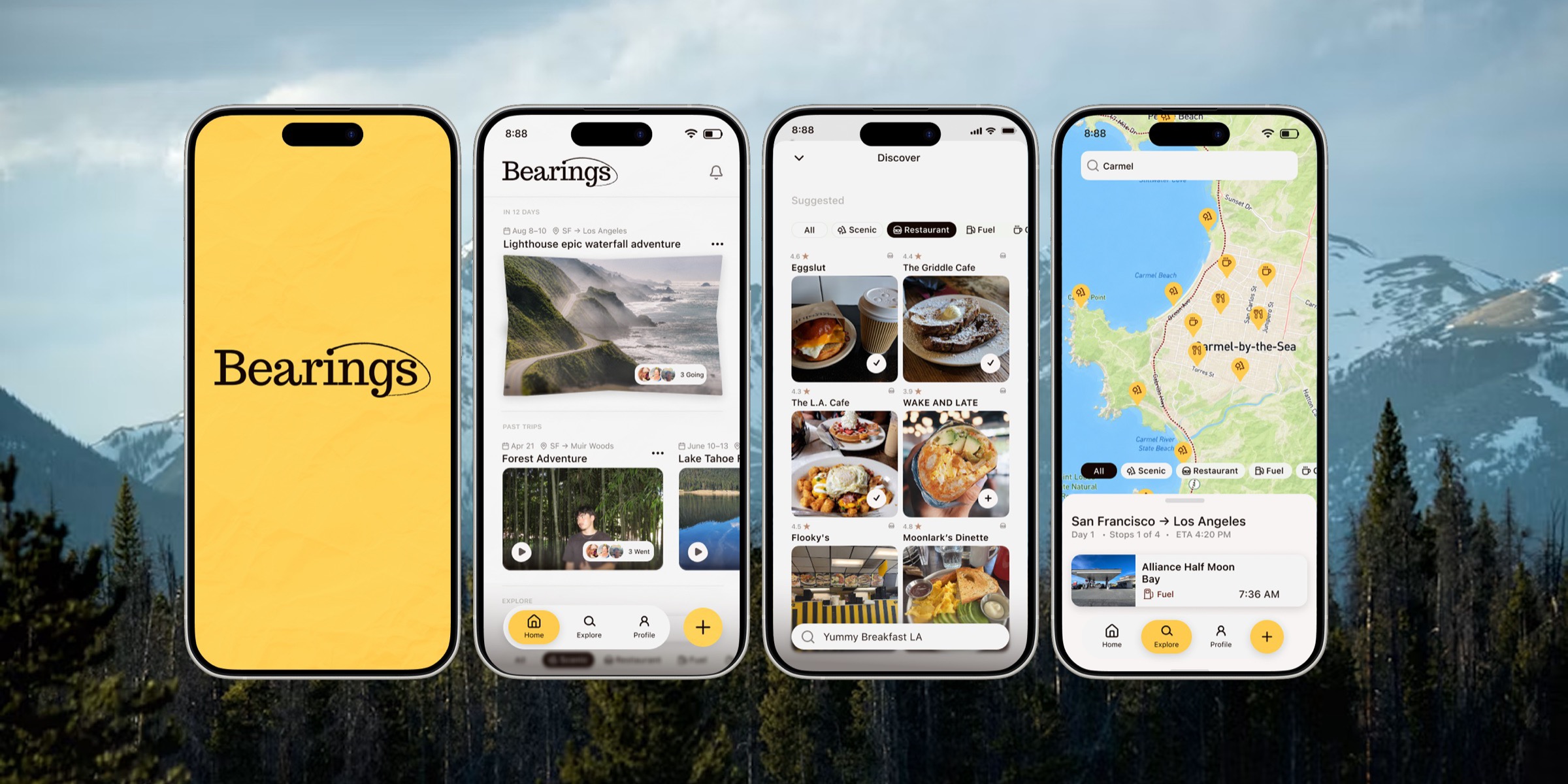
Bearings was designed around a familiar trip-planning problem: even a fun weekend drive gets split across maps, group chats, notes, and camera rolls, so the experience feels scattered before the trip even starts.
The concept brings route planning, destination discovery, crew coordination, and trip recap into one playful mobile flow. Instead of treating the trip as only logistics, Bearings also makes room for shared memories and a sense of momentum before, during, and after the drive.
The result: a warmer travel concept that helps friends start a route faster, explore along the way, and keep the story of the trip in one place once it is over.
This concept was developed in the Design Interactive Cohort with a collaborative team and a road-trip planning prompt.
Overview
Bearings was shaped around a simple idea from the road trip planner concept: group travel should feel more connected and less fragmented. A trip usually moves between route research, stop ideas, planning details, and photos, but most tools only solve one piece at a time.
This concept pulls those pieces together into a single experience. Users can start a new trip, build a route, discover nearby places worth stopping at, and revisit the journey later through a recap view that keeps the trip feeling alive after the drive ends.
My Role
Within the Design Interactive Cohort team, I owned three parts of the Bearings experience — making the journey feel explorable, keeping every page easy to understand, and giving the group a real way to decide together.
Designed the interactive map at the heart of the trip view, so the route, stops, and places worth exploring feel tangible instead of buried in a list.
Shaped the page layouts and hierarchy so every screen reads at a glance — travelers always know where they are in the plan and what to do next.
Designed the poll system that lets everyone on the trip vote on where to eat, where to stop, and what to visit — turning group opinions into decisions the plan can act on.
The starting point
Bearings started as a broad road-trip planning idea, so the first step was making the concept clearer before moving deeper into interface decisions. We used these early slides to pressure-test the direction, narrow the scope, and identify what would actually make the product useful for group travel.
From there, the team discussed how the experience should balance trip setup, coordination, and discovery, making sure the concept felt more intentional than a generic route tool. The user persona helped ground those conversations in a more specific traveler type, so decisions were tied to real planning habits, motivations, and pain points instead of broad assumptions.
Together, the critique slides and persona work gave the rest of the project a stronger foundation and shaped how the sketches, prototype, and final product decisions came together.
The friend who starts the group chat and maps the route — needed one place to wrangle dates, stops, and everyone's input instead of endless back-and-forth.
Along for the ride and there for the memories — wanted to weigh in on stops, then look back on the places the group visited and the pictures taken along the way.
Help groups plan a road trip together in one place — turning scattered texts, links, and half-made decisions into a clear, shared itinerary everyone can shape?
Low-Fi Sketches
The early Bearings sketches were used to map the core experience before moving into higher-fidelity screens. They helped break down how onboarding, preference setup, group coordination, homepage structure, and trip itinerary planning should connect in one road-trip flow.
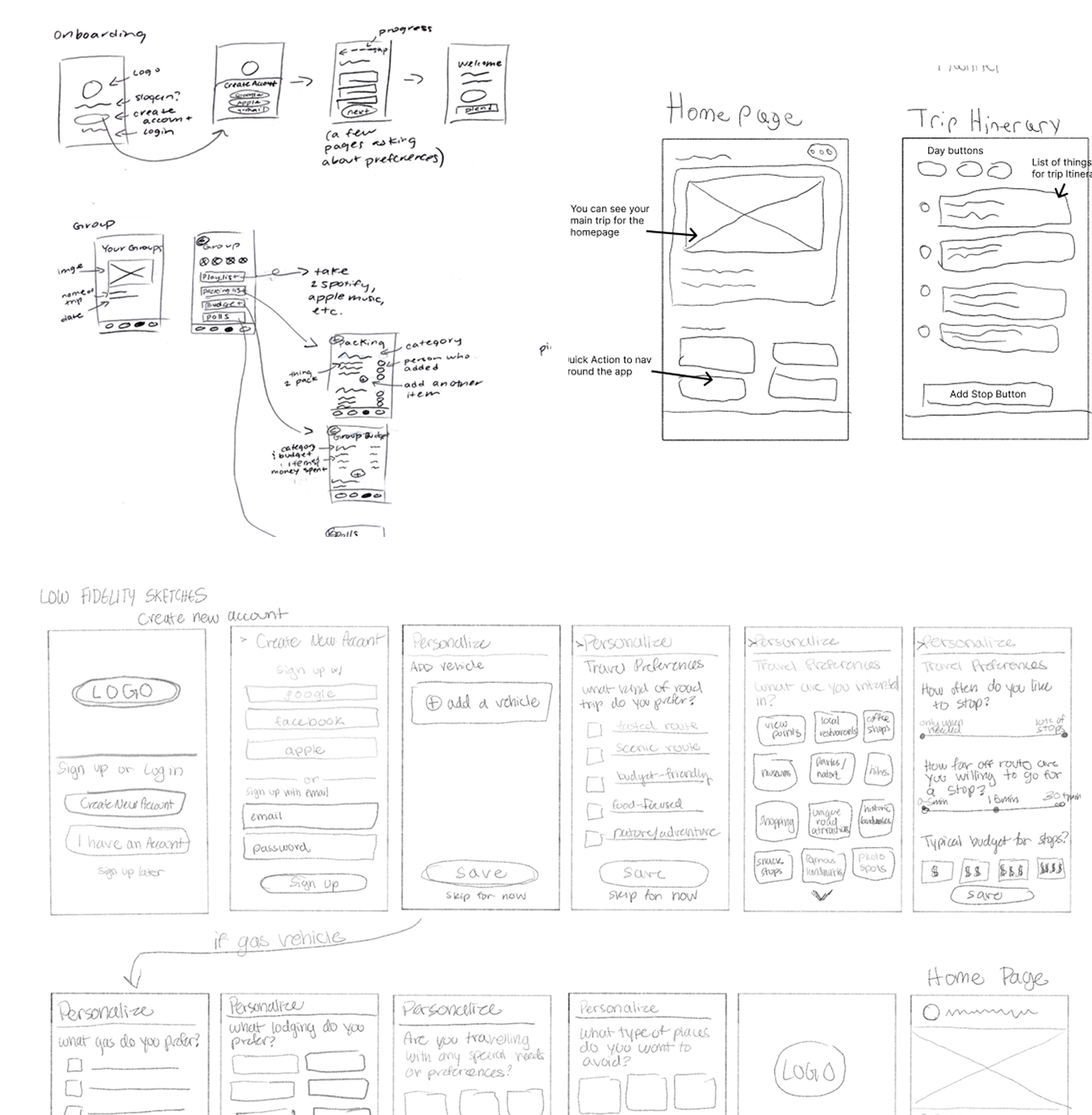
Low Fi + Mid-Fi
After the earliest sketch exploration, the next step was tightening the Bearings experience into a low-fi flow and then a mid-fi pass. That progression helped the team lock in the app structure, simplify trip setup, and make collaborative route planning feel more intentional before moving into the final visual system.
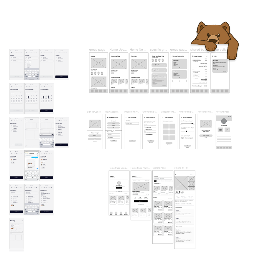
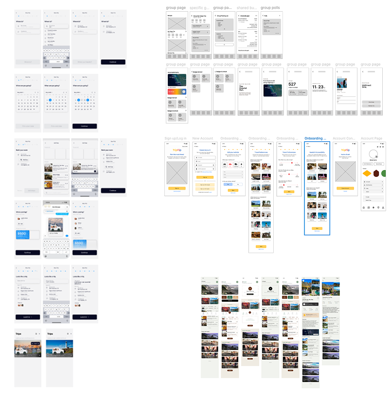
Design System
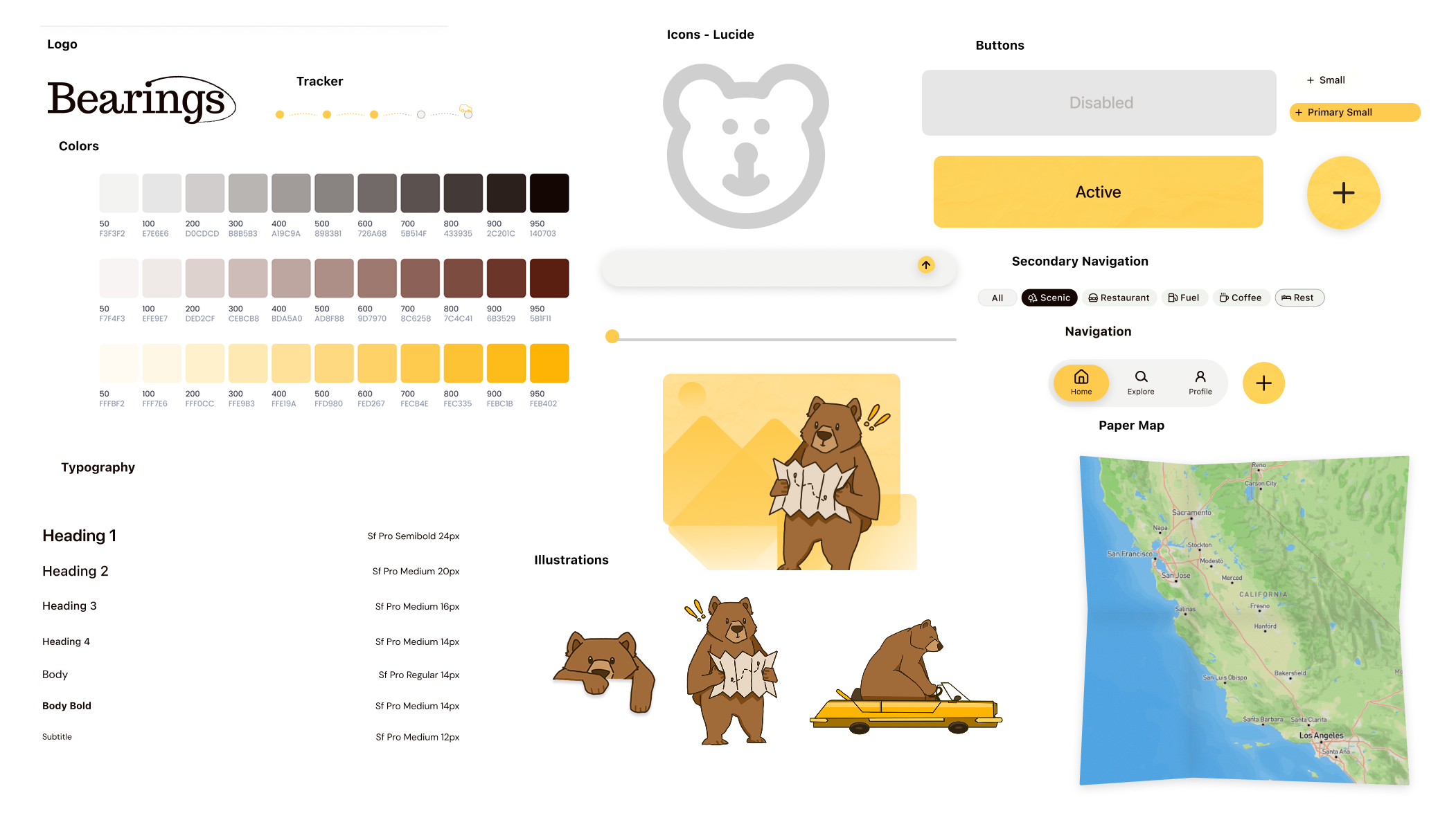
The system leans on soft neutrals, a strong yellow accent, a custom bear illustration set, and clean mobile components to make the app feel inviting. That balance matters here because the concept needs enough clarity for planning, but enough personality to make the road-trip theme memorable.
Interactive Product Showcase
Bearings was designed to guide users from first-time setup into collaborative planning and then into route discovery. This interactive showcase highlights how the experience changes as users move from personalizing the trip to building it with others and exploring places worth stopping for.
Onboarding helps travelers personalize the trip from the start by capturing preferences, vehicle details, and the kind of road trip they want.
Users can build the route, organize stops, and coordinate decisions with the group so the planning process feels shared instead of chaotic.
Once the trip is in motion, Bearings surfaces useful and interesting places to stop so discovery feels built into the journey itself.
Bearings Group Poll System
One of the more useful collaborative features in Bearings is the group poll system. Instead of leaving route choices, stop ideas, or activity preferences buried in a group chat, the app gives the crew a shared place to vote on options and quickly see where everyone stands.
That matters because road trips usually involve a lot of small decisions, and those decisions can slow the trip down when there is no clear way to compare opinions. The poll system helps Bearings feel more social and more actionable by turning group input into something the planner can actually use.
What this surfaces well: The feature turns group preferences into a clearer planning signal, which helps Bearings support collaboration instead of adding more coordination noise.
Outcome
Bearings shows that a trip planner can do more than build a route. It can support coordination, invite exploration, and preserve memories without making the interface feel crowded.
The next step would be stress-testing collaboration moments like inviting the crew, updating shared plans, and handling changes mid-trip so the concept feels even stronger in real group use.
One possible direction would be premium features built around AI. For example, users could describe the kind of trip they want, and Bearings could generate a more tailored road-trip guide with suggested stops, pacing, and route ideas based on that request.
AI can help with ideas, but Bearings was designed to be more group-interactive than a one-way planning tool. It gives people a shared space to coordinate decisions together, and the recap page adds something AI alone would not: a place to store memories from the trip, including stops you visited, pictures you took, and details from past trips that make the experience feel personal and worth revisiting.
They helped us clarify who Bearings was for, what moments mattered most, and how onboarding, preferences, itinerary planning, and group coordination should connect before we invested in higher-fidelity UI.
I’d test how groups create trips together, how quickly people understand the poll system, and whether the balance between planning structure and lightweight discovery still feels easy once multiple travelers are actively contributing.