Onboarding
A focused setup flow helps users choose the areas they care about without front-loading too many decisions. Large targets, plain language, and clear progress make the first experience feel calm and direct.

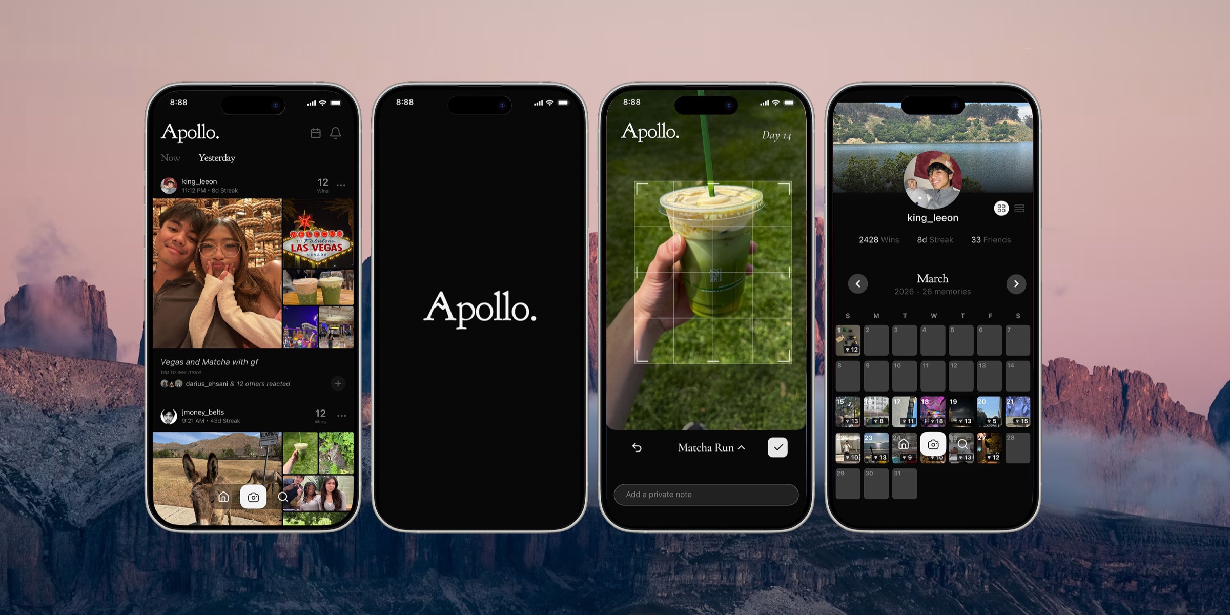
Apollo is a social app that helps people capture the progress that usually goes unnoticed. My role focused on three moments that make that idea useful over time: a guided onboarding, a personal profile, and a calendar that turns daily wins into a visual history.
View the founder's full product storyOverview
Apollo began with a simple insight: meaningful progress often happens in small, quiet moments that never feel important enough to celebrate. The app gives those moments a home by letting people capture daily wins and share them with close friends who can witness the work behind the outcome.
The wider product direction is intentionally calm and ADHD-conscious. Instead of an endless feed, attention-grabbing color, or shame-based motivation, Apollo keeps the interface restrained so personal photos and genuine progress stay at the center.
My contribution
I focused on the parts of Apollo that establish a user's identity and give their wins meaning over time. Each view needed to feel useful on its own while staying consistent with the product's quiet, grayscale system.
A focused setup flow helps users choose the areas they care about without front-loading too many decisions. Large targets, plain language, and clear progress make the first experience feel calm and direct.
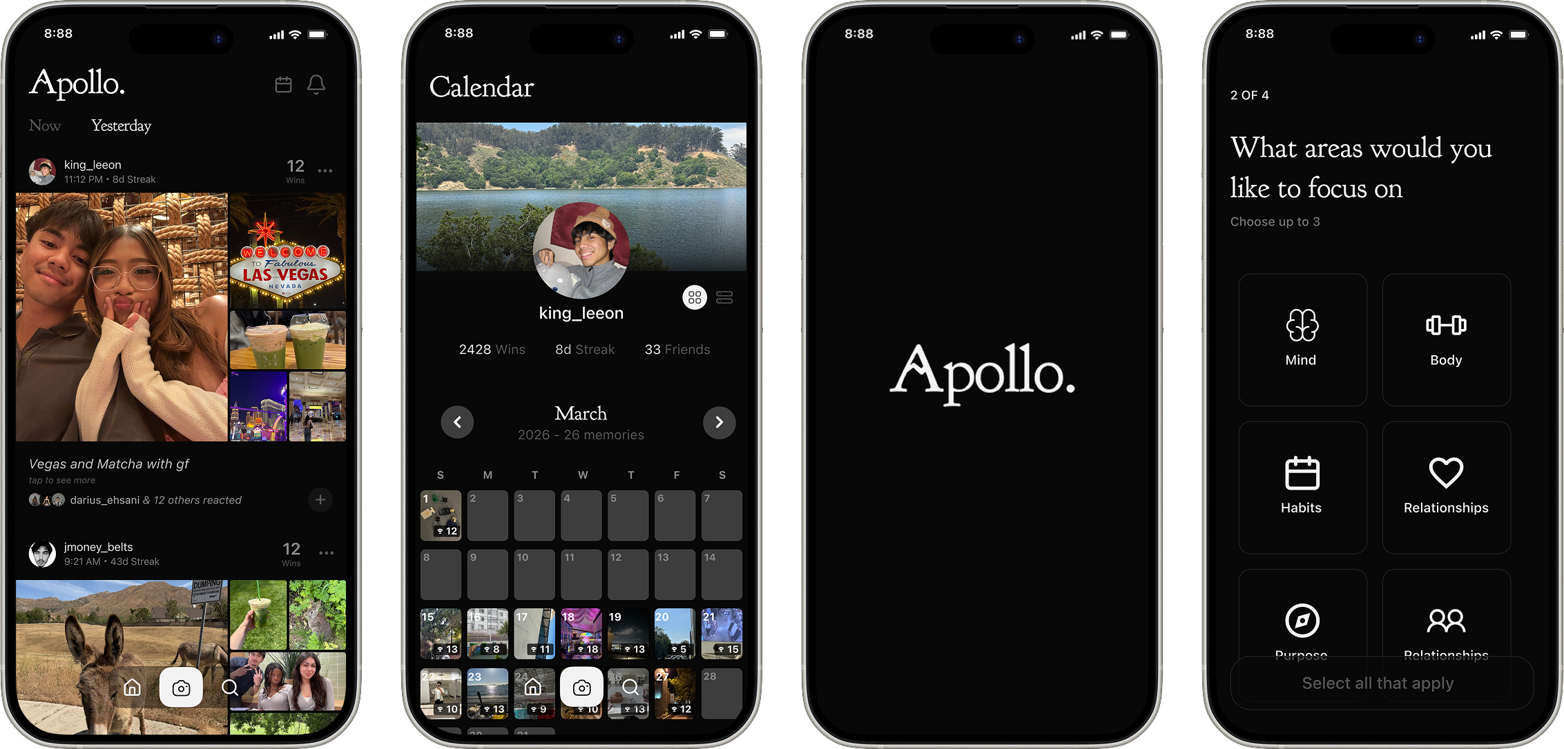
The profile brings identity, friends, total wins, and past memories together in one place. It works as a personal archive rather than a public scoreboard, keeping the focus on what the user has built.
The calendar turns isolated posts into a visual record. Photo-filled days make consistency visible at a glance, while month controls keep the experience familiar and easy to revisit.
Design decisions
Apollo's interface stays nearly monochrome so the user's own photos become the emotional layer. I carried that principle through each screen while using hierarchy, spacing, and familiar patterns to keep complex information approachable.
The calendar uses a recognizable month grid so users immediately understand how to browse their history.
The profile organizes personal progress and memories without making social ranking the main event.
Onboarding breaks preference setup into clear steps with large controls and one decision at a time.
The experience
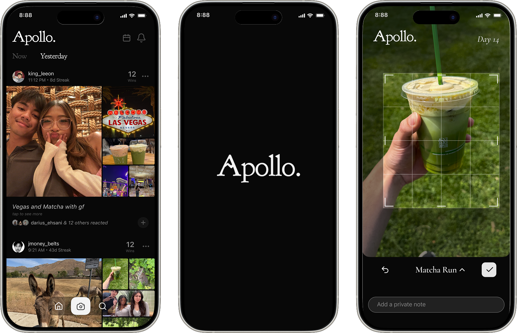
The feed captures the present, the profile gives it identity, and the calendar adds time. Together they make everyday progress easier to notice, revisit, and share with the people who matter.
Interactive Product Showcase
A walkthrough of the onboarding flow I designed — from the first open to a ready profile, without overwhelming the user.
Sources: Appcues · Business of Apps · JMIR (2024)
The homepage keeps the feed centered on today, while the profile view I designed gives every user a personal place to see who they are and what they've been building.
Source: Charle, BeReal statistics (2026)
The calendar I designed gives you two ways to look back: a grid view, similar to BeReal's, that lays out every day at a glance — or a stack view that layers your photos into a collage of the memories you've been building.
Source: Fujifilm national survey
Outcome
Apollo is still being developed and refined. My contribution helped extend the core product beyond the daily feed by giving users a gentler introduction, a clear sense of self, and a way to look back across time.